What's wrong with SIS4
Charles University recently released a preview of a new user interface for their Student information system (SIS). The whole system was developed in the 90's or early 2000's and it is natural that after some time the application needs a refresh of some kind. The newly released preview of the SIS4 introduces a new user interface which should bring modern elements to the application. I was unpleasantly surprised when I first saw the interface. For now, I will skip the fact that it looks like a blog and not like a mature system where students register for lectures, check exam results and teachers should administrate their courses. Before I decided to write this critique I proposed some changes to the user interface, but they were rejected with the justification that it would slow down the development and transition to the new system. To be completely honest I have to note that some of the issues I describe in this article were discovered after I sent in my proposed changes.
Someone forgot that not all people use a mouse
The first major issue I noticed is the absence of a keyboard only navigation support. I understand that these users are often overlooked by small developers and to be completely honest, when I noticed this problem I found some issues with my own website as well. However, in case of a system like the Charles University's SIS which is used by more than tens of thousands students with different needs, this is a major issue. Not every user on the web has the ability to use a mouse, some prefer a keyboard as it can make navigation faster, some simply don't have another option. How bad is the problem with SIS' UI? Almost every button misses a styled :focus state, but moreover the default :focus state is often removed so there is no visual signalisation where the user is. Many custom made elements like these checkboxes are excluded from the keyboard navigation completely.
 You can't check/uncheck these checkboxes on a keyboard
It is not designed for people with visual impairments
The second major issue is the fact that the website was not designed with visually impaired users in mind. For example, when I switch on the simulation of the most common visual impairments I am unable to tell whether the following toggle button is in an on or off state. The title of the column in the table header is not very helpful either as the described states are reversed. Thankfully there are not many places where the website relies on colours to describe a state. But if it is used, it is done incorrectly. The issues don't concern only colours: the font-size varies dramatically and in some cases the text is too small.
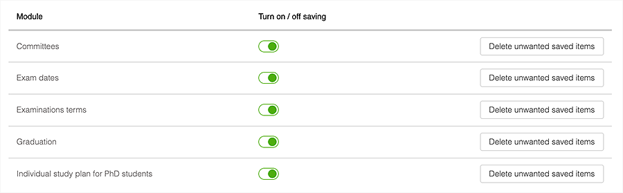 I guess it is clear that these toggles are on
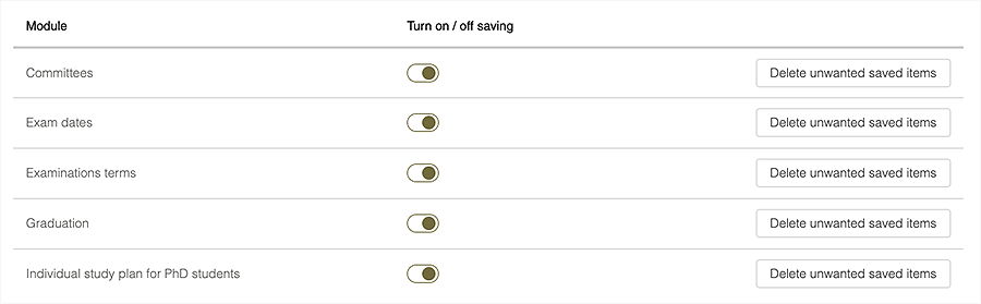 Is the state of the toggle still clear? The screenshot was taken with a Deuteranopia filter on.
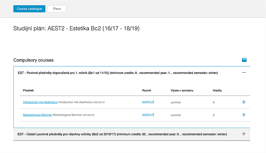
Why so empty and bordered?
The design is spacious, but chaotic. If you follow at least one designer on any social network, you'll definitely find some posts saying that negative space is super-important and I could not agree more. However, it must be clear which parts of the content are related and which aren't. In case of the user-interface of SIS the negative space breaks the feeling of consistency and introduces confusion. On some pages like the Study plan below, the title is too far away from the content and thus the negative space supports feeling that there is something missing. The tables use a small font with paddings that are too large so the cohesion feels broken in some way, not to mention the title of the table that is again too far.
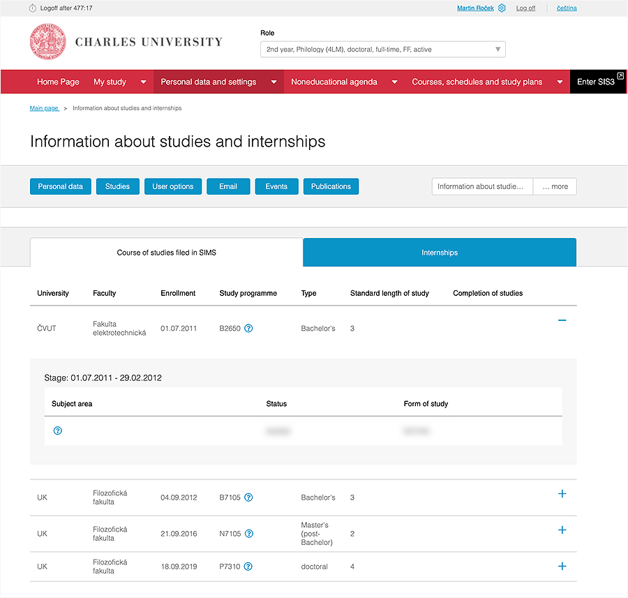
 Did you notice the cut off border?
Another thing I am not a fan of are the borders, when you open certain pages there are alternating grey and white sections without any visual reason. An extreme example is the page on the screenshot where the two grey sections are divided with an empty white one. The white section introduces a feeling that something is broken on the page. This feeling is further strengthened when you open the item in the table and see a large grey wrapper which is not padded evenly around the white table.
 This is how the full page looks like
Conclusion
These were definitely not all the issues I see with the redesign of the user-interface of Charles University's SIS. However, I do not have any reason to dig deeper as for now the aforementioned issues would make any design unusable. However, I might write another article with some design proposals with an explanation of common design problems. In case this article is read by some of the developers who worked (or are still working) on this app I will be more than happy to help you fix these issues or give you more information about how to solve them.
Do not ignore accessibility on your websites. 🙂 It is easy to implement and you'll improve the browsing experience for many visitors of your website. In case you do not know where to start, check these resources: access guide Instagram and accessibility tricks and resources for designers at Stark's website.